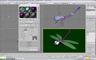
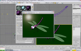
 Start off with the head. This bit's nice and easy. 2 slightly flattened spheres make the eyes (Remember how to flatten? We used the 'scale' tool, remember?) A 3rd one created the face, and sat inbetween the eyes. The 'nose/mouth' section that sits on top is simply a hemisphered sphere. The 'hemisphere' tool was covered in the 'Snail' 3D sandbox. Chop down the hemisphere and rotate until it looks presentable. The main section of the torso was simply a sphere pulled. The same with the smaller part of the back housing the wings. The tail was a cylinder, bent upwards slightly using the 'Bones' tool covered previously. The tail extra can be anything. Here, it was a sphere pulled about a bit. As you can probably notice, the legs are all made up of bones. Each one was a cylinder with 5 bones in each (Of course, I made 1 and cloned it). They were attached and moved about where needed. The wings are made from a 'spline' (Line tool drawn into an ellipse shape), and converted into an editable mesh (not poly). The wings are translucent due to the material editor (I tested out some basic materials before exporting it to finish off properly). Beware, 3DSMax normally complains about meshes housing patterns. If it does, go to modify and select 'UVM Map'. That'll shut it up and place the texture on it. Luckily, whilst we don't have screenshots of the creation... we do have screenshots of the texturing!
 These are the textures that were applied to Mr Dragonfly. The wings in particular, took several goes (Far right). They were created in Flash, as that has better line-drawing tools, and then just print-screened and edited in Photoshop. The eyeballs (Bottom centre) were also made in Flash with a simple criss-cross lattice of lines. However, the 'bulge' was done in Photoshop's 'Liquefy' option (Normally used to warp the faces of your mates and have a good giggle about. Yeah, you know who you are). Pick the tool that 'bulges' the image, and use it on the lattice. The skin for the torso and sub-sections (Top 2) were made from brushes with low flow and opacity. Pick a colour, go crazy, pick another colour, go crazy...and repeat until you get bored or have a heart attack. Blurring sometimes helps to 'flatten' the colours.
 First up were the wings. It took several failed attempts in lectures... but here they finally are! Now there's a reason why the wing-veins were black...
A translucent shader is the best one here. Take the opacity right down, and add give the wings a nice splash of colour. A pale blue works nicely for the wings, as would something like a mint green or light turquoise. Where does the wing texture come in? Scroll the menu down until you see the sub-menu for 'Maps'. Open it. You'll spot several different 'places' for maps to be used. The one needed here is the 'bump' map. 'Bump' uses the texture to create... well 'bumps'. It basically cuts and digs holes, following the pattern of the map you give it. It makes more sense if you see it in action. Basically, the wing map was given to it. What happened, was that it left all the 'white' areas untouched, and made trenches/grooves where the black ones were. Result? The wings now had veins cut into them! To further emphasise the 'grooves' and pick out the lighting, the 'specular level' was upped, so that the tips of the wings and veins now caught the light. Good stuff!
 The eyes were pretty much the same. Only this time, the grooves weren't as deep, and they were a lot more opaque than the wings. Other than that, the texture was pretty much the same.
 The torso housed the larger of the skins. Organic materials are best made with the 'Oren-Nayar-Blinn' option ('Organic Shader' wasn't a good enough name, so the creator decided to stick his cryptic name there instead...) The skin had a decent bit of specular (To make it shiny, like a carapace is), but not much else done to it.

And there it is! Sav the Dragonfly (Named after the guy who taught me how to use the 'Bones' tool) and the first part of May's image. Some lighting was also added to the scene. A couple of Omni lights were placed here and there, to illuminate the whole image. A spotlight was also directed onto the top, to act like sunlight. During the testing of lighting, I also added a nice little 'glare' in one of the Omni lights. This is purely showing off, and at the moment, isn't functional to the image (Yet! Watch this space!)
Next thing to do is to add something for Sav to be standing on (No way am I going to try and make the wings look like they are in mid-flight...)
No comments:
Post a Comment