Wednesday 29 October 2008

Week VI - Assignment - September - Phase 1: Leaf

Week VI --- 27/10/08 ---
It's not over yet, dear denizens of the interweb! One 3D image is not enough for people these days. So time to crack on with the second month! In a rare show of courage, I decided to tackle my newly-formed, deep-seated hatred of leaves and foliage. In other words: get it over and done with.

The idea for said leaf is to have it floating on top of a puddle... or something like that. Either way, wanted a Maple Leaf in it. Maple syrup is incredibly lovely, and I owe it to the syrup, for the amount of joy it has allowed me to extract from my pancakes.

So here's the start of it: One Maple Leaf:

"Why have you made an entire post on an image you stole off Google!?" I hear you exclaim through your SnackaJacks... or whatever it is that people eat at computer desks nowadays. However, this leaf isn't something taken off a search engine or scanner...

This leaf is, in actual fact, scratch-built.

A 2 hour tutorial spent trying to make a representable leaf. Again, due to it being during class, this was more of a practise run, so images of it's actual construction are lacking. I will, however, explain how it was done. Some of the steps might be useful for creating other stuff, so take notes!

Step 1: Opened up Flash (Personally, Photoshop is ok for editing images... but for creating them, Flash just seems to be several times better. The pen tool is also vastly superior). Did a web-search for a Maple Leaf, found a nice one and put it into the stage. (Ok, so I did sort of use an Internet image. This was more to act as a guide though)

Step 2: The leaf was put into a suitable place on the stage, and the layer locked. A new layer above it was created. All that was left to do now was to slowly trace the image. The pen tool really came into its own here. Just draw the basic lines. The curves aren't too important... yet! The important thing are the vertices. The corners and points are the bits that needed to be there! (Doing this on another layer meant that the original image wouldn't be 'overwritten' or get in the way)

Step 3: The lines and vertices were then all carefully tweaked and edited. The important thing was the attempt to match the outline of the leaf. It's so much easier tracing and matching like this. Seriously. I sketched out the leaf onto paper and tried to 'make' it in Flash, but you get better results if you have the image to base the lines upon. The ink bottle tool also allowed the leaf to be coated with a nice orange outer trim (Was better to work with black to begin with, as it's more visible)

Step 4: Filling the leaf was done with the gradient tool. In Flash, if you click the 'fill' button, then over in the colour properties, you have a little drop-down menu. Go for 'linear', as that looks a little bit better than radial for this. It was then just a case of tweaking several different colours and constantly fine-tuning it until it worked. In short, it's about getting darker colours at the side, and trying to get lighter ones nearer the centre and running up where the veins were to go.

Step 5: The veins were incredibly easy. Just pick a dark colour, use the line tool (Thin lines!) and work away! Bend and tweak where necessary, but otherwise, it's a really simple step. It was made on another layer though (Reasoning will be explained shortly) Making thinner lines for the 'minor' veins help to add a bit of realism to it, and stops the veins looking like a a network of felt tip lines drawn over the leaf by a 5 year old.

Step 6: NOW it was time for photoshop to come into the picture. The leaf was copied over (Vie printScreen, which gave a bigger result than a simple copy-paste). The real image and the veins layer were hidden, so only the 'basic' leaf shape and colour remained. From here, it was copied and stuck onto another layer (So there were 2 identical layers). Then came in an old friend: 'Mosaic Tiles', previously seen with the daisy's flower (Before you complain about grammar, the 'flower' is the 'head' of a plant). As before, the line thickness and cell size were pretty much taken to their lowest level. This is why the leaf has the slightly grainy pattern on it. It's just the mosaic tiles again! All that was left was to place a mask over the layer, and edit out the lines and tiles from outside the leaf (As the tiles are applied to the entire layer)

Step 7: To finish, the veins layer was then also copied over, and placed on top of this image in its own layer (This way, the veins were not affected or distorted by the mosaic tiles effect. Hence why it was built in its own layer)

Step 8: Had a nice cup of tea

Assignment - May - Phase 4: Completed... for now...

The picture for May is almost complete! The only thing left was to add a nice, stylish backdrop to it all. A morning mist was pretty much the vital prerequisite. Whether the background was a forest/lake/mountains wasn't too vital. I attempted to create a scene in 3DS Max... but quite frankly it proved laborious. Lighting was going to play a major role, and trying to get the right fog, filters and textures was pretty painstaking. Understandably, this is the point of the assignment. However, I was only making the background (Purely for some yummy eye candy and atmosphere), and it was going to be blurred heavily anyway! (In order to represent perspective. It also heightens the focus on the important bit, which is the dragonfly, flower and rock!). So I decided to use an existing image. Nothing works and weaves lighting/mist better than nature itself (obviously), so let it do some of the work!
Managed to find a few spectacular images and scenes with mist in them. But this one won me over! It was a nice forest scene (Suitable backdrop), it's misty, there's a good shade and strength of light... and it just looked the part. Making this in 3DS Max would have taken longer than the rest of the images put together!
It had to be tweaked before it could be used though. Posting it behind the current image really looked abnormal. Not only did the dragonfly look like it was about 20 feet long, but the background caused too much attention to be detracted from the important images (AKA. My stuff!). So the first thing to do was to put a moderate 'Gaussian Blur' on it. Not only did this add some 'focus' to the image, but also helped to represent mist. The mist effect was enhanced with an increase in the picture brightness, and a slight decrease in contrast.

All that was left to do now was to put it onto the scene! And talk about good luck! Remember that little flare effect from before? You know, the Omni Light? No, not that one, the other one. That's the one! Well, looks like luck gave me an even break today... the flare has fitted in perfectly at the top of the image, and has made it look as if the sunlight is bursting through the tree tops! Absolutely marvellous!

So here it is! May, completed... for now... I would ideally like to add a few 'shafts' of light to the scene, but it would be best to complete the other images first and get them out of the way before I start tinkering with the image. So for the time being: Saved, backed up and completed!

Job Done! 1 down, 2 to go!

Sunday 26 October 2008

Assignment - May - Phase 3: Flower

Time to add a nice flower to the scene! It's bright, it's colourful, it emphasises Spring... and more importantly, it's cliche.
Starting off is nice and easy. The stem is merely a cylinder tweaked with the bend tool.

The 'housing' segment of the flower is just a sphere hit heavily with the 'hemisphere' tool. But just to 'attach' it properly to the stem, it was converted to an editable mesh and pulled about a bit.

The main segment of the flower head is a flattened sphere. This one's pretty easy, isn't it?

Ah, here we go. The flower had to be awkward and just had to have petals didn't it? Do not fear, this is easier than it looks. Much like creating the dragonfly's wings, create a 'spline' using the line tool. Then using either the edit vertices or 'bones' tool, twist the petals a bit to give them more of a realistic curve/bend in them. Make one, then just clone it repeatedly, rotating and adjusting until they fit around the flower head.

With all the petals rotated into shape, it should look something like this.

A little leaf was also added to it, as a testament to my former idea (And, more importantly, visual effect!) 'Bones' tool once again helped out on this one! Though not yet textured... doesn't it still look lovely?

So let's put it in the scene! This is done with the 'merge' option, found under 'File'. The flower was saved and opened up within the current image for May. Now, it didn't arrive on the scene this cleanly. In reality, it was tiny. However, the handy 'scale' tool saved the day here. The flower was moved, grown and placed into position like so. It's a little on the dark side, but pretty much spot on.

Though the petals and stem could get away with a simple texture, the flower head needed something a lot more stylish than a giant button. The pattern of a daisy is nice. But how to achieve the near honeycomb-like style of it? Simpler than it seems! First up, a small document was opened in Photoshop and given a healthy splash of yellow. The texture was achieved all in one simple move. First up, set the main colour as a dark yellow. Under 'Filter', was the 'Mosaic Tiles' option. And that's all there is to it! The cell size was tiny, along with the border size (The light intensity was left, to brighten up the centre of the texture), and previously selecting a dark yellow colour meant that the border lines were said yellow. Job done! All that was left was to open up a blank white document of the same size, and changing the colour to black, repeat (Luckily, Photoshop temporarily remembers the last filter you did. So just hit that again, and it'll do it all for you, with all the exact settings). This ones for the bump! (The same thing used on the dragonfly's eyes and wings)

And there it is! One daisy! The yellow honeycomb map was used for the 'Diffuse', and the black and white one was used for the 'bump'. You might also notice a more 'sunny' glow on the picture. That's because I found the colour options within the lighting! Seen as these objects were to be bathed in sunlight, the colour was changed to a sunny yellow... and thus everything now has that sun-kissed look to it! Lovely! The flower also got its own spotlight, as it felt left out. Just a background map needed and that's 1 month completed!

Assignment - May - Phase 2: A Seat

Where does a dragonfly sit? The original plan was a large leaf. The idea seemed perfect... the dragonfly on a leaf, with a light morning haze in the background, with a single tear of dew hanging onto the tip of the leaf... nice...
However, 2 evenings, several cups of tea and a toasted sandwich later... I decided to give up on the leaf idea. Creating the leaf was actually pretty easy. Making the shape and bending it to the right angle and direction was incredibly easy. The correct shapes took a few goes... but it wasn't too bad. The hell was in the texture. Leaves are pure evil. Not only do they have a nitty-gritty texture, but also have veins running down them. Photoshop/Flash didn't produce any good'uns. Some decent ones came out, but the veins were just insane. I even went outside (in the cold) snatched a leaf off a tree and drew the veins by hand. After that... I then had to try and get the veins to fit on the leaf correctly. The only 2 options were to get an image of one off the Internet, or scan one. Unfortunately, Google images is cheating (I think so anyway), and Mid-October isn't exactly the best month to go out looking for large, bright, vibrant green leaves... so I chose to scrap the idea. (I'm probably making a leaf for September anyway, so one headache is more than enough). A dragonfly is too heavy for a leaf anyway...
So I retreated to the idea of a rock. It seemed a little bit more natural, and the scene could work into a nicer idea anyway (A dragonfly on a rock by an idyllic pond. Get a bit of sun reflection in and it'll look quite nice!)
So to the rock. It was build within the 'Dragonfly' document. To ensure that the dragonfly didn't get in the way, it was 'hidden', thus allowing me to make the rock without getting distracted by the sexy textured wings. Rocks are crystallised and jagged... so working from a sphere would take too long. So I made a dome using the lovely 'Lathe' tool. Starting off with a simple jagged-half-semi-circle shape (Remembering to put the pivot point in the corner!), it was lathed into to dome shape you see above.

For the next 5-10 minutes or so, to the awesome tracks of Coldplay, the rock was converted to an editable mesh, and the vertices pulled about and played with, to create more of a realistic rock shape. After a while, I soon had a presentable shape. The whole of it wasn't vital, as I only needed the top bit (Remember, we only need to 'perfect' what's actually going to be seen!)

All that was left was to place the dragonfly on top if it! So it was 'unhid', to bring it back to the screen. The rock was then rotated and moved so that it nestled beneath the dragonfly (It was a whole object, and thus easier to manipulate than moving the entire dragonfly)

The legs were then tweaked so that they sat on the rock (Made incredibly easily with the 'Bones' tool!) From the previous lighting effects added, shadows were also added, meaning that the dragonfly now cast a shadow onto the rock. All that's left is the texture!

Whilst this might look rather complicated, it's actually just a lucky dip of Photoshop effects. If blogspot lets you open the picture in your browser (It sometimes hates opening pictures out so you can see them close-up), you can see the effects used on the little menu to the right. Started off with the previous "Light Brush and lots of colours" approach, the mesh of rocky colours were enhanced with "Grain", "Fragment" and "Add Noise" tools (All found under the 'Filter' menu)

All that was left was to add the texture to the rock! No specular levels needed. Just add the texture and job done! There we go! A place to sit! Doesn't Sav look happy now?

The left is a bit empty though... say... wouldn't a flower work nicely there...?

Assignment - May - Phase 1: DragonFly

Assignment time! And time to start cracking on with the Calendar months! May wasn't chosen for any special reason, other than the fact that I already had half a dragonfly made... so I thought I might as well finish it and get that month out of the way. Unfortunately, I do not have screenshots of the creation of the dragonfly itself. It was made during lectures, and was actually a 'Beta' dragonfly. I wanted to have a play about with lighting, making bugs and using the newly learnt bone structure... so I decided to test them on a dragonfly (Which I was planning in doing in the assignment) and have a bit of a muck-about with it. Then, at home, make the proper thing. Turns out that it went better than expected, and instead of wasting time making another one at home, keep the one I made! So I'm afraid no screenshots, but I'll try and detail the creation as well as I can:
Start off with the head. This bit's nice and easy. 2 slightly flattened spheres make the eyes (Remember how to flatten? We used the 'scale' tool, remember?) A 3rd one created the face, and sat inbetween the eyes. The 'nose/mouth' section that sits on top is simply a hemisphered sphere. The 'hemisphere' tool was covered in the 'Snail' 3D sandbox. Chop down the hemisphere and rotate until it looks presentable. The main section of the torso was simply a sphere pulled. The same with the smaller part of the back housing the wings. The tail was a cylinder, bent upwards slightly using the 'Bones' tool covered previously. The tail extra can be anything. Here, it was a sphere pulled about a bit. As you can probably notice, the legs are all made up of bones. Each one was a cylinder with 5 bones in each (Of course, I made 1 and cloned it). They were attached and moved about where needed. The wings are made from a 'spline' (Line tool drawn into an ellipse shape), and converted into an editable mesh (not poly). The wings are translucent due to the material editor (I tested out some basic materials before exporting it to finish off properly). Beware, 3DSMax normally complains about meshes housing patterns. If it does, go to modify and select 'UVM Map'. That'll shut it up and place the texture on it. Luckily, whilst we don't have screenshots of the creation... we do have screenshots of the texturing!
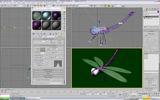
These are the textures that were applied to Mr Dragonfly. The wings in particular, took several goes (Far right). They were created in Flash, as that has better line-drawing tools, and then just print-screened and edited in Photoshop. The eyeballs (Bottom centre) were also made in Flash with a simple criss-cross lattice of lines. However, the 'bulge' was done in Photoshop's 'Liquefy' option (Normally used to warp the faces of your mates and have a good giggle about. Yeah, you know who you are). Pick the tool that 'bulges' the image, and use it on the lattice. The skin for the torso and sub-sections (Top 2) were made from brushes with low flow and opacity. Pick a colour, go crazy, pick another colour, go crazy...and repeat until you get bored or have a heart attack. Blurring sometimes helps to 'flatten' the colours.


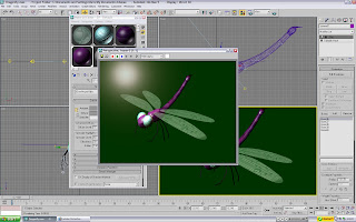
First up were the wings. It took several failed attempts in lectures... but here they finally are! Now there's a reason why the wing-veins were black...

A translucent shader is the best one here. Take the opacity right down, and add give the wings a nice splash of colour. A pale blue works nicely for the wings, as would something like a mint green or light turquoise. Where does the wing texture come in? Scroll the menu down until you see the sub-menu for 'Maps'. Open it. You'll spot several different 'places' for maps to be used. The one needed here is the 'bump' map. 'Bump' uses the texture to create... well 'bumps'. It basically cuts and digs holes, following the pattern of the map you give it. It makes more sense if you see it in action. Basically, the wing map was given to it. What happened, was that it left all the 'white' areas untouched, and made trenches/grooves where the black ones were. Result? The wings now had veins cut into them! To further emphasise the 'grooves' and pick out the lighting, the 'specular level' was upped, so that the tips of the wings and veins now caught the light. Good stuff!

The eyes were pretty much the same. Only this time, the grooves weren't as deep, and they were a lot more opaque than the wings. Other than that, the texture was pretty much the same.

The torso housed the larger of the skins. Organic materials are best made with the 'Oren-Nayar-Blinn' option ('Organic Shader' wasn't a good enough name, so the creator decided to stick his cryptic name there instead...) The skin had a decent bit of specular (To make it shiny, like a carapace is), but not much else done to it.

The same with the sub-torso segments... A bit of a shiny pattern, but otherwise simple.


And there it is! Sav the Dragonfly (Named after the guy who taught me how to use the 'Bones' tool) and the first part of May's image. Some lighting was also added to the scene. A couple of Omni lights were placed here and there, to illuminate the whole image. A spotlight was also directed onto the top, to act like sunlight. During the testing of lighting, I also added a nice little 'glare' in one of the Omni lights. This is purely showing off, and at the moment, isn't functional to the image (Yet! Watch this space!)

Next thing to do is to add something for Sav to be standing on (No way am I going to try and make the wings look like they are in mid-flight...)

3D Sandbox: Bones!

Though this isn't meant to be covered until next Semester, I've been told about a wonderful little trick, which I just have to share with you lot. It's about using bones to aid movement! "Movement!? But we're not doing animation!" I hear you exclaim... (Please exclaim it now. Shout it at your computer monitor, it'll make me feel special). Whilst it is true that bones are tailored for making moving joints and limbs so much easier, there is nothing to stop them being a practical tool in still life! Observe:
Look at this cylinder. Wouldn't it be nice to make a tree branch out of it? Obviously, tree branches are not that straight. They're normally jagged and almost like a zig-zag. Now, if you want to bend it, you could just use the 'bend' tool. But what if you need more than 1 bend? Multiple cylinders? Sit there for ages with the 'Vertices' tool, pulling it this way and that? You can do that if you want... or you could do it like this...

Watch closely. Here's how you use bones in 3DS Max...


First up, you need to make the bones. In the sub-menu where you can create normal shapes (Top left arrow), look for the little set of cogs at the far right (The arrow furthest right). Select this, and then select the 'Bones' option (Bottom arrow).

All you do now is create them! You make them like you do any other shape. Click, move to where you want it, then click again to fix that bone. The next will automatically begin. When you want to stop, right-mouse click. Draw a chain of about 3-4 bones inside your cylinder. Don't worry if you don't create them inside it, you can move the cylinder or the bones (Moving the 'foundation' bone: ie the first one you place. Will move the lot of them) to fit. Move everything around until the bones fit comfortably inside the cylinder. Don't worry about the bone shapes. They're not shown when you render!


Before you can start to move them, however, you need to 'attach' them to the cylinder. So click on the cylinder (Make sure that is the one selected, not one of the bones), and under the modify tools, look for 'Skin'. You should have a small menu appear on the left. Above the blank white box, click 'Add', to add components (Specifically: Bones) to the skin. A window should come up in the centre. From here, pick the bones you want to 'connect', and add them.

If you've done the job right, you should see the bones now listed in the previously empty white box on the side of the screen. This is a good thing.

What you can do now is move/rotate each bone, and mould the cylinder to your liking! If you want to move the entire thing, move the 'foundation' bone. If you move the shape, you will move it away from the bones. As you will see, moving/rotating a bone will pull the cylinder with it. Here, you can now create several joints and bends effortlessly.

As you can now see, the twig upon rendering has lost the bones, but also been twisted and bent into a more twig-like shape. With any other method, this would have taken a lot longer. But thanks to bones, it's been made much quicker. Seriously, bones are a God-send. Anything that requires a slight bend/twist are generally best done via bones. Why work harder when you can work smarter?

Week V: Lights!

--- 20th Oct ---

Welcome back!

Week 5's lecture covered the basics of lighting and shadows. These and textures are basically the key finishing points to creating realistic looking 3D goodies.

The main bits covered were usage of 'Spot Lights' (Essentially, creating a specific beam of light at a target) and 'Omni Lights' (More 'general' lights for lighting and effects), and how to edit the effects/strength/properties of each of them.

Omni lights are nice and easy. They're literally point-and-click. When clicked onto the screen, they just appear and give out light. In practise, they're better used as a 'volume' lighter... something to add overall lighting to a scene. 'Lens Effects' can also add some stylish extras to it, like glows or rings.

Spot lights are dragged into place. The first click places it, and then dragged to create the 'field' of light.

The initial thing I found was the ability to change the colour of the lights. They're set to white by default... however, the light can be changed to help influence the 'mood' of the scene. For example, a yellow light would help to make a scene more 'summery'.

Whilst I do not have any specific examples from the lecture itself, keep an eye out for lighting to appear in the assignment's work!

Wednesday 15 October 2008

3D Sandbox : Snooker Table

Welcome back for some more fun with textures and mapping! I, of course, use 'fun' in the broadest possible sense, as I can pretty much guess that most of you can think up several more fun things than making snooker tables. Bear with it though. If you think reading blogs is a boring activity, then please spare a thought for me, who has to write them. I'd rather write a thrilling novel involving pirates, hedge trimming and Tony Carter (Our head of computing)... but that's just the way it goes really... Anyhoo, to the 3D stuff:
First up, we make the table itself. 2 flat boxes, essentially. The only additional bit is a ProBoolean to chop a nice hole out of the centre, thus giving us the surface of the snooker table. And before you comment, yes, I am aware that snooker tables are a lot thicker than that...

Next bit is to add the trim. This is indeed purely for style and showing-off purposes. A set of cylinders with spherical 'caps' on the corners are pretty sufficient to make a decent trim to the table. It's a fiddly process, but shouldn't be too taxing.


ProBoolean help to cut out the holes in the table. Just place several spheres around where the pockets go, and pick them out. Now you have somewhere to pot. Goodo.


The legs aren't really anything fancy either. A pair of cones with a sphere in the middle. To make your lives easier, make one leg and clone it. Consistency with little effort and less time... what more could you want? Oh, a car? Well now you're just being picky aren't you? Anyways, your table is pretty much done now.


Time to add the snooker balls! Again, this is nothing you lot shouldn't be able to handle unless you're too occupied with Facebook whilst you're making this. Log off and focus. Come on now, it's not like the chat function is any good. Get back to work. You can poke people later. Just make a single ball, and clone several times. The only tricky bit is setting up the reds in the triangle. But chip away at it slowly and you should be fine.

Texture time! The wooden siding was made much like the snail's shell from the previous 3D Sandbox. Just set the 'flow' of the photoshop brush to something like 30%, pick some nice browns and go nuts. The trim is made using the 'Anistropic' shader (Change it from Blinn). Pick a golden brown (Wonderful song by The Stranglers which I hope to learn on piano soon) and up the Specular Level and Glossiness. Also, because the trim is made of long tubes, up the anistropy to create an elongated reflection.

The snooker balls were patterned with high Specular and Glossiness settings (On the default 'Blinn' shader) to give them a nice shiny look to them, without making them metallic. All you need to do then is pick the appropriate colours in the 'Diffuse' option.


Job done... or is it? If you look at a snooker table, it has a 'D' and a line at the top of it. (It also has spots for the blue, pink and black, but these are covered so aren't as important). Oh yeah, adding the green matt to just that face (and not the whole shape) is acquired through the 'modify' object menu. Set it to select just faces, select it, and drag the texture to it.


The matt is then made up. 3DS Max moulds the map to fit the surface it is placed on. As we are only applying this to a single face, it will stretch the overall shape to fit, but shouldn't distort it (Like if it was applied round a ball, for example). So don't worry too much about the dimensions of it. The D-shape was made by creating a circle, copying it, then shrinking the copy slightly. Then just delete/colour in the copy, and you now have a nice circle outline. Delete half of it and you have your D!


...apply this to the table, and you're done! Wonderful stuff. I'm so chuffed I just might explode.

Now back to fighting crime... Captain Pineapple... away!

Monday 13 October 2008

3D Sandbox : Snail

Welcome back to 3D Sandbox! This demonstration will cover more shape manipulation and throw textures into the mix. I know it's not much of a treat, and that you'd probably prefer a PS3 instead... but it'll have to do. If it's any consolation, it's a very friendly snail called Dennis.
Making the eyes aren't as daunting as they may seem. They're actually pretty easy. Start off with a sphere (Make 1 eyeball and then clone it, to ensure consistency). Then simply create a small sphere (The diameter of which you want to be the size of the pupil. From here, play with the scale of the 'pupil'. However, instead of a general grow/shrink: only shrink 1 dimension (x or y). This creates a flat sphere, that now looks more like a game counter. Place this onto the eyeball, and you have a simply cartoony eye! The body is just a sphere (for the moment).
This is where it gets fun! Change the sphere into an 'editable poly', and click the 'vertices' button on the right-hand toolbar. Also scroll to the 'soft selection' menu and tick the box (You want to be able to pull a good bit of the shape, not just a single point). From here, it's just about playing with the shape until it is 'slug' enough for you.
The eye stalks are also pretty easy too. In the same way you compress the scale of the pupil to become more 'disk-like', you do the same for the stalks. Only this time, you compress both the X and the Y dimension. This gives you a handy little tube.
All you do then is covert them to an 'editable poly', and play with the shape. Pull and bend them until you are happy.
The eye lids are made from larger spheres. Draw a sphere from the same centre point as the eyaball, but make it a little bit bigger so that it completely covers it. Adjust the diameter so to alter the thickness of the eyelid. From here, you then tweak the eyelid's 'hemisphere' properties, in the parameters menu. Take it up to '50', to halve the sphere, and rotate to suit the eyeball if necessary
The shell is also very easy. Those of you who have actually read what's been written will probably notice that the shell is just another compressed sphere. If you noticed it, reward yourself with a cookie. To make the indent in the centre of the shell (A simplified way of showing the spiral), uncheck soft selection and move just the single, centre point inwards.

The shell trim was the trickiest bit. Here, it was made the hard way by maipulating a sphere around the edges. There must be an easier way to do this though... Either way, the snail is pretty much done. Unfortunately, it seems rather plain. The initial joy of seeing spheres cut holes into swiss cheese with a proBoolean has quickly waned, and now the images require a little bit more to give them the "You-have-no-social-life" factor to them. This is done in the way of maps and textures. Read on!

It's green! Not only that... it's sexy too!

The mottled green now means that the snail's skin looks more... well... "snail-like". This is the result of a simple bitmap file made in Photoshop. I'll admit, the skin pattern wasn't a carefully thought out and heavily detailed job. Quite literally: open Photoshop, fade the brush slightly (So it creates a faded mark more than a single plain colour), and go bonkers with murky greens and the odd mucky brown here and there for good measure.

The shell also wan't a very laborious process. Just going beserk with browns, burnt browns and greys. All that needs to happen now is to save them as bitmaps. Then open up your material editor and set the map to the bitmap you made.


With the patterns now saved as textures, all that's left to do is to edit them until they are perfect. And then just start applying them!

And there you have it! One happy snail.