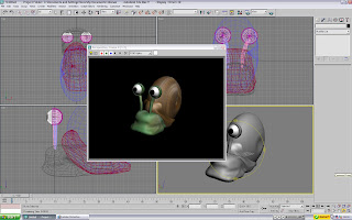
Welcome back to 3D Sandbox! This demonstration will cover more shape manipulation and throw textures into the mix. I know it's not much of a treat, and that you'd probably prefer a PS3 instead... but it'll have to do. If it's any consolation, it's a very friendly snail called Dennis.
Making the eyes aren't as daunting as they may seem. They're actually pretty easy. Start off with a sphere (Make 1 eyeball and then clone it, to ensure consistency). Then simply create a small sphere (The diameter of which you want to be the size of the pupil. From here, play with the scale of the 'pupil'. However, instead of a general grow/shrink: only shrink 1 dimension (x or y). This creates a flat sphere, that now looks more like a game counter. Place this onto the eyeball, and you have a simply cartoony eye! The body is just a sphere (for the moment).
This is where it gets fun! Change the sphere into an 'editable poly', and click the 'vertices' button on the right-hand toolbar. Also scroll to the 'soft selection' menu and tick the box (You want to be able to pull a good bit of the shape, not just a single point). From here, it's just about playing with the shape until it is 'slug' enough for you.
The eye stalks are also pretty easy too. In the same way you compress the scale of the pupil to become more 'disk-like', you do the same for the stalks. Only this time, you compress both the X and the Y dimension. This gives you a handy little tube.
 All you do then is covert them to an 'editable poly', and play with the shape. Pull and bend them until you are happy.
The eye lids are made from larger spheres. Draw a sphere from the same centre point as the eyaball, but make it a little bit bigger so that it completely covers it. Adjust the diameter so to alter the thickness of the eyelid. From here, you then tweak the eyelid's 'hemisphere' properties, in the parameters menu. Take it up to '50', to halve the sphere, and rotate to suit the eyeball if necessary
 The shell is also very easy. Those of you who have actually read what's been written will probably notice that the shell is just another compressed sphere. If you noticed it, reward yourself with a cookie. To make the indent in the centre of the shell (A simplified way of showing the spiral), uncheck soft selection and move just the single, centre point inwards.
The shell trim was the trickiest bit. Here, it was made the hard way by maipulating a sphere around the edges. There must be an easier way to do this though... Either way, the snail is pretty much done. Unfortunately, it seems rather plain. The initial joy of seeing spheres cut holes into swiss cheese with a proBoolean has quickly waned, and now the images require a little bit more to give them the "You-have-no-social-life" factor to them. This is done in the way of maps and textures. Read on!
 It's green! Not only that... it's sexy too!
The mottled green now means that the snail's skin looks more... well... "snail-like". This is the result of a simple bitmap file made in Photoshop. I'll admit, the skin pattern wasn't a carefully thought out and heavily detailed job. Quite literally: open Photoshop, fade the brush slightly (So it creates a faded mark more than a single plain colour), and go bonkers with murky greens and the odd mucky brown here and there for good measure.
 The shell also wan't a very laborious process. Just going beserk with browns, burnt browns and greys. All that needs to happen now is to save them as bitmaps. Then open up your material editor and set the map to the bitmap you made.
 With the patterns now saved as textures, all that's left to do is to edit them until they are perfect. And then just start applying them!
And there you have it! One happy snail.


 All you do then is covert them to an 'editable poly', and play with the shape. Pull and bend them until you are happy.
 The shell is also very easy. Those of you who have actually read what's been written will probably notice that the shell is just another compressed sphere. If you noticed it, reward yourself with a cookie. To make the indent in the centre of the shell (A simplified way of showing the spiral), uncheck soft selection and move just the single, centre point inwards.
 It's green! Not only that... it's sexy too!
 The shell also wan't a very laborious process. Just going beserk with browns, burnt browns and greys. All that needs to happen now is to save them as bitmaps. Then open up your material editor and set the map to the bitmap you made.
 With the patterns now saved as textures, all that's left to do is to edit them until they are perfect. And then just start applying them!

No comments:
Post a Comment